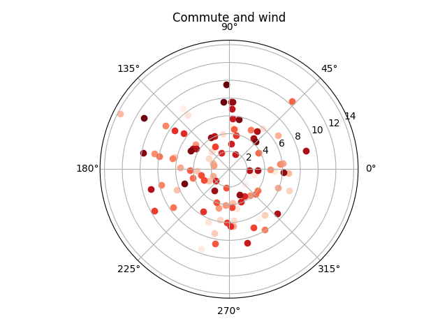
The article was updated 17.05.2018 with wind direction data.
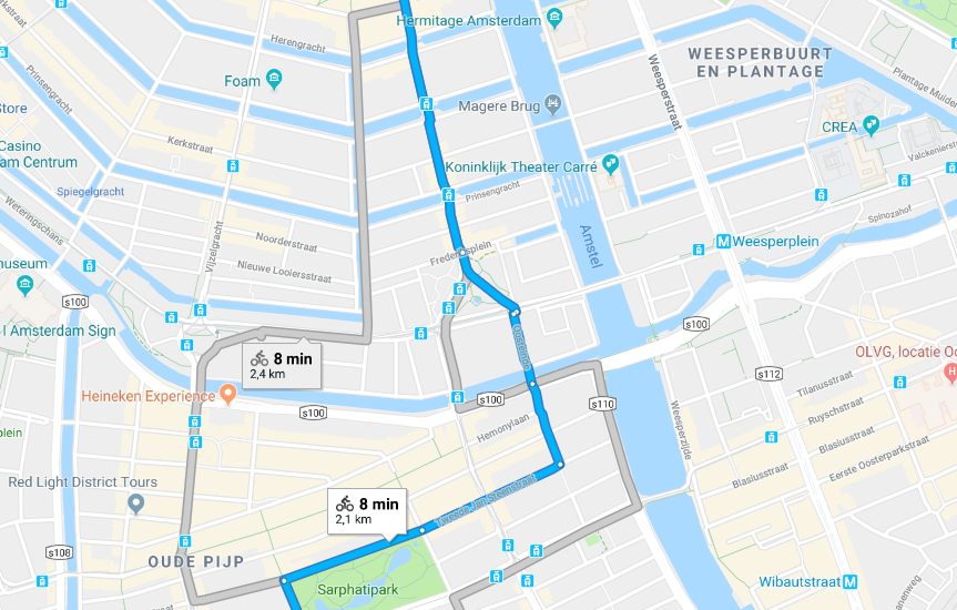
Since I moved to Amsterdam I’m biking to work almost every morning. And as Google is always tracking the location of my phone, I thought that it might be interesting to do something with that data.
First of all, I’ve downloaded Location History data dump in json from
Download your data page. The format of the dump is very simple,
it’s a dict with locations key that contains a lot of entries like this in descendant order by date:
{
    "timestampMs" : "1525120611682",
    "latitudeE7" : 523508799,
    "longitudeE7" : 488938179,
    "accuracy" : 15,
    "altitude" : 49,
    "verticalAccuracy" : 2
}
It’s very easy to parse it with Python:
import json
from datetime import datetime
from collections import namedtuple

Point = namedtuple('Point', 'latitude, longitude, datetime')


def read_points():
    with open('data.json') as f:
        data = json.load(f)

    for point in data['locations']:
        yield Point(
            point['latitudeE7'] / 10 ** 7,
            point['longitudeE7'] / 10 ** 7,
            datetime.fromtimestamp(int(point['timestampMs']) / 1000)
        )

points = read_points()
>>> [*points]
[Point(latitude=52.350879, longitude=4.893817, datetime=datetime.datetime(2018, 4, 30, 22, 36, 51, 682000)), ...]
As I moved to my current place in November, it’s safe to ignore all entries before:
from itertools import takewhile

from_date = datetime(2017, 11, 1)

after_move = takewhile(lambda point: point.datetime >= from_date, points)
And weekends:
work_days = (point for point in after_move
             if point.datetime.weekday() < 5)
Usually, I’m heading to work between 9 am and 10 am, but as the Netherlands are switching between summer and winter timezones, it will be safer to treat everything between 7 am and 9a m as possible commute time:
from_hour = 7
to_hour = 12

commute_time = (point for point in work_days
                if from_hour <= point.datetime.hour < to_hour)
Then I grouped everything by date:
from itertools import groupby

by_days = groupby(commute_time, key=lambda point: point.datetime.date())
>>> [(day, [*vals]) for day, vals in by_days]
[(datetime.date(2018, 4, 27),
 [Point(latitude=52.350879, longitude=4.893817, datetime=datetime.datetime(2018, 4, 27, 11, 58, 17, 189000)), ...]),
 ...]
After that, I selected the last point at home and the first point at work for every day. A point considered home or work if it’s distance from home or work is smaller than 50 meters. The distance can be easily calculated with geopy:
from geopy.distance import geodesic

home = (52.350879, 4.893817)  # not really =)
work = (52.3657573, 4.8980648)

max_distance = 0.050

def last_at_home(points):
    result = None
    for point in points:
        if geodesic(home, point[:2]).km <= max_distance:
            result = point
    return result


def first_at_work(points, after):
    for point in points:
        if point.datetime > after.datetime and geodesic(work, point[:2]).km <= max_distance:
            return point


Commute = namedtuple('Commute', 'day, start, end, took')


def get_commute():
    for day, points in by_days:
        points = [*points][::-1]

        start = last_at_home(points)
        if start is None:
            continue

        end = first_at_work(points, start)
        if end is None:
            continue

        yield Commute(
            day, start.datetime, end.datetime, end.datetime - start.datetime,
        )


commutes = [*get_commute()][::-1]
>>> commutes
[Commute(day=datetime.date(2017, 11, 2), start=datetime.datetime(2017, 11, 2, 9, 39, 13, 219000), end=datetime.datetime(2017, 11, 2, 9, 52, 53, 295000), took=datetime.timedelta(0, 820, 76000)), ...]
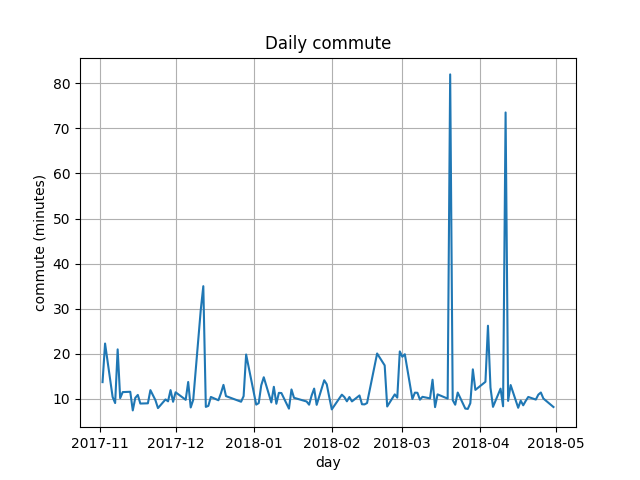
Now it’s easy to plot a graph of daily commute with matplotlib:
from matplotlib import pyplot

fig, ax = pyplot.subplots()
ax.plot([commute.day for commute in commutes],
        [commute.took.total_seconds() / 60 for commute in commutes])

ax.set(xlabel='day', ylabel='commute (minutes)',
       title='Daily commute')
ax.grid()
pyplot.show()
It’s easy to spot days when I had appointments in the morning:
Then I thought that it might be interesting to look for a correlation between temperature and commute time, and wind speed and commute time. I found data dump of daily weather that KNMI provides, the nearest meteorological station is in Schiphol airport, but I guess it’s close enough. The data is in easy to parse format:
# STN,YYYYMMDD,DDVEC,FHVEC,   FG,  FHX, FHXH,  FHN, FHNH,  FXX, FXXH,   TG,   TN,  TNH,   TX,  TXH, T10N,T10NH,   SQ,   SP,    Q,   DR,   RH,  RHX, RHXH,   PG,   PX,  PXH,   PN,  PNH,  VVN, VVNH,  VVX, VVXH,   NG,   UG,   UX,  UXH,   UN,  UNH, EV24

  240,19510101,  188,   77,   87,  195,   18,   41,   24,     ,     ,   12,  -13,    1,   26,   20,     ,     ,     ,     ,     ,     ,     ,     ,     , 9891, 9957,     , 9837,     ,     ,     ,     ,     ,    7,   90,   98,    6,   73,   20,
  240,19510102,  153,   41,   41,   82,    4,   10,   21,     ,     ,   13,    7,    4,   18,   19,     ,     ,     ,     ,     ,     ,     ,     ,     , 9876, 9923,     , 9853,     ,     ,     ,     ,     ,    8,   93,   98,    9,   88,    1,
I only used FG (Daily mean wind speed in 0.1 m/s), TG (Daily mean temperature in 0.1 degrees Celsius)
and DDVEC (Vector mean wind direction in degrees):
from dateutil.parser import parse

Weather = namedtuple('Weather', 'windspeed, temperature, wind_direction')


def read_weather():
    result = {}

    with open('weather.txt') as f:
        for line in f.readlines():
            if not line.startswith(' '):
                continue

            data = [part.strip() for part in line.split(',')]
            result[parse(data[1]).date()] = Weather(
                int(data[4]) / 10,
                int(data[11]) / 10,
                int(data[2]),
            )

    return result

weather = read_weather()
>>> weather
{datetime.date(1951, 1, 1): Weather(windspeed=8.7, temperature=1.2, wind_direction=188),
 datetime.date(1951, 1, 2): Weather(windspeed=4.1, temperature=1.3, wind_direction=153),
 datetime.date(1951, 1, 3): Weather(windspeed=2.1, temperature=0.3, wind_direction=203),
 ...}
Before doing this I’ve excluded spikes from days when I had appointments:
normalized = [commute for commute in commutes
              if commute.took.total_seconds() < 60 * 20]
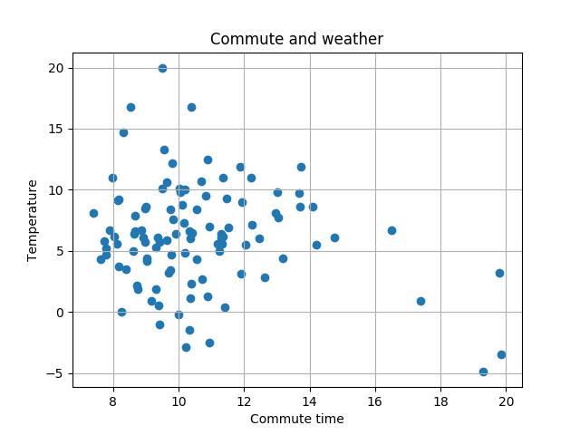
Then I created a scatter plot of temperature and commute:
fig, ax = pyplot.subplots()
ax.grid()
ax.scatter([commute.took.total_seconds() / 60 for commute in normalized],
           [weather[commute.day].temperature for commute in normalized])
ax.set(xlabel='Commute time', ylabel='Temperature',
       title='Commute and weather')
ax.legend()
pyplot.show()
Correlation is slightly visible, on cold days commute is a bit faster:
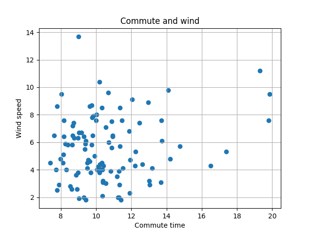
With wind speed code is almost the same:
fig, ax = pyplot.subplots()
ax.grid()
ax.scatter([commute.took.total_seconds() / 60 for commute in normalized],
           [weather[commute.day].windspeed for commute in normalized])
ax.set(xlabel='Commute time', ylabel='Wind speed',
       title='Commute and wind')
ax.legend()
pyplot.show()
And the correlation is more visible, the commute is slower with stronger wind:
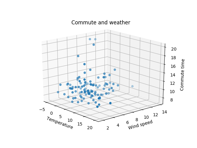
Then I’ve tried to combine the previous two graphs in one 3d graph:
from mpl_toolkits.mplot3d import Axes3D

fig, ax = pyplot.subplots(subplot_kw={'projection': '3d'})
ax.grid()
ax.scatter([weather[commute.day].temperature for commute in normalized],
           [weather[commute.day].windspeed for commute in normalized],
           [commute.took.total_seconds() / 60 for commute in normalized])
ax.set(xlabel='Temperature', ylabel='Wind speed', zlabel='Commute time',
       title='Commute and weather')
ax.legend()
pyplot.show()
And the result didn’t give me anything:
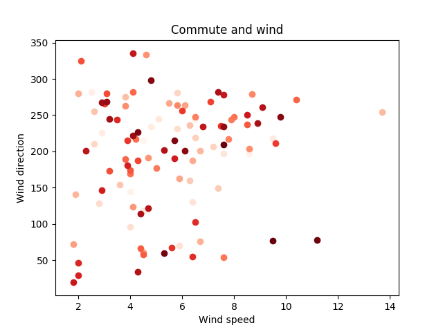
After that I thought that it would be interesting to look at a possible correlation of commute time, wind speed, and direction:
from matplotlib import cm

colors = iter(cm.Reds(np.linspace(0, 1, len(normalized))))

fig, ax = pyplot.subplots()
ax.grid()

for commute in sorted(normalized, key=lambda commute: commute.took.total_seconds() / 60):
    ax.scatter(weather[commute.day].windspeed,
               weather[commute.day].wind_direction,
               color=next(colors))

ax.set(xlabel='Wind speed', ylabel='Wind direction',
       title='Commute and wind')

ax.grid()

pyplot.show()
Longer the commute, redder the dot:
Wind direction doesn’t look that well on that plot, so I’ve tried to use polar plot:
colors = iter(cm.Reds(np.linspace(0, 1, len(normalized))))

fig, ax = pyplot.subplots(subplot_kw={'projection': 'polar'})

for commute in sorted(normalized, key=lambda commute: commute.took.total_seconds() / 60):
    ax.scatter(weather[commute.day].wind_direction,
               weather[commute.day].windspeed,
               color=next(colors))

ax.set(title='Commute and wind')

ax.grid()

pyplot.show()
And it’s much more “readable”:
